Registry
The Registry is a dedicated website designed to empower consumers by providing transparency into the data we collect from them. It allows users to easily view the specific information gathered, how it is being used, and offers them the option to opt out and request the deletion of their data. This platform prioritizes user control and privacy, giving individuals the ability to manage their data preferences in a simple and accessible way.
WEBSTIE DESIGN

Requirements
Goals
☝🏼Re-working the current UI to better display the data
✌🏼Improving responsiveness of the site and mobile experience
🤟🏼Improving accessibility
☝🏼 More user friendly and transparent about how Registry works and what type of data it collects
✌🏼Honors and maintains user selections and reflect any updates in their data collection preference
Storyboard
Based on the varying knowledge levels and specific purposes of different users, I created four distinct use case scenarios to illustrate when and how these different users would interact with the website. These scenarios take into account factors such as the users' familiarity with the platform, their objectives for visiting, and how they navigate through the website to achieve their goals. By understanding these different contexts, I was able to design a more tailored experience for each user group.
Web
User Journey
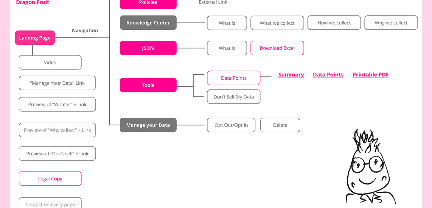
I outlined the user journey for every user profile, highlighting the steps they would take from entry to goal completion, and marking the most critical paths and decision-making points. This approach helped to ensure a smooth and intuitive experience for each type of user, aligning with their specific objectives and enhancing usability.
Design Directions
For the visuals, I explored two potential directions: illustration and photography, each with its own pros and cons. Ultimately, I decided to go with photography as it feels more mature and trustworthy. From a maintenance perspective, photography is also easier to update with content-related images.


Direction 1: Illustrations
Pros: It brings a fresh, clean vibe with a touch of modern style.
Cons: It can be a bit time-consuming to whip up all those fun illustrations and animations.


Direction 2: Photography
Pros: Clean aesthetics and monochromatic photography are unique for a technology company.
Cons: Not consistent with brand guidelines.
Final Design
The final design embraced the photography direction, using images from our brand system. This solution not only maintains consistency across all company products but also simplifies maintenance. Since we own the copyrights, it’s easy to swap out content-related images with new updates whenever needed.


