Whitewave
WhiteWave is driven by a mission to improve the world’s food systems. The essence of this brand— changing the way the world eats for the better. This transformation was not just about a visual redesign; it was about creating a meaningful, icon-driven brand identity that captured the company’s core values and resonated with both employees and stakeholders.
For this project, I had the opportunity to work with the client to help bring this rebranding vision to life. I was responsible for creating a cohesive user experience that aligned with the brand’s mission, ensuring that the design elements reflected the company's commitment to sustainability, health, and positive change.
ILLUSTRATION
ICON
BRAND


Employee Value Icon Set
The Employee Value icon set consists of three key themes: Value in Action, Learning for Life, and Rewards at Work. While these icons may appear simple at first glance, the development process took several weeks of extensive research and exploration. Below, I will walk you through the entire process of creating this icon set.
Value in Action
Learning for Life
Reward at Work
Step 1: Find the right metaphor
I began by selecting one or two metaphors for each icon to establish the basic look. Initially, I created both outline and solid versions of the icons. After evaluating both styles, we decided to move forward with the outline version for its simplicity and clean aesthetic, which aligned better with the overall design direction.

Step 2: Adding detials
Once the basic look was finalized, I began adding more details to enhance the icons. I incorporated design elements such as cutting parts of the graphic to mimic the effect of line drawing, which gave the icons a more dynamic and layered appearance. I also experimented with using two colors within a single icon to create contrast and depth. Additionally, I utilized shorter lines to depict the objects, giving the icons a more modern and streamlined feel. These adjustments helped make the icons more visually engaging while maintaining their simplicity.

Step 3: Brainstorming for more possibility
Learning for Life
For the "Learning" icon, I focused on more straightforward metaphors. The first symbol that came to mind was a book, as it is universally associated with learning and knowledge. I also explored additional symbols like pens, apples, and light bulbs, all of which are commonly linked to wisdom and education. By combining these elements, I was able to create an icon that clearly communicates the concept of learning while keeping it simple and easily recognizable.
Rewards at Work
For the "Rewards" icon, I chose relevant metaphors that are universally associated with incentives and achievements. Symbols like a carrot, gift, coins, and a piggy bank naturally came to mind, as they are all commonly linked to rewards, savings, and tangible benefits. By incorporating these elements, I was able to craft an icon that effectively communicates the idea of rewards, while keeping the design both intuitive and visually appealing.
Values in Action
“Value” is a very abstract word, I mainly use “heart” as the metaphor here. However, even this one concept, can develop lots of possibility. For example, use hands to form the heart shape; heart with a growing tree - different shape of the tree; heart as a conversation bubble, etc,.
Final Icon Design
The final design uses the "Star," "Apple," and "Heart" as metaphors, each representing a key theme: recognition, knowledge, and passion. The design is simple yet neat, making it easy to remember and visually appealing. All the icons are enclosed within a circle, creating a uniform and cohesive feel across the set. To differentiate each icon, I used the brand's color palette, which adds a sense of individuality while staying true to the brand identity. I also incorporated a unique design style by cutting parts of the stroke, giving the icons a distinctive look that brings an element of playfulness. To add depth and visual richness, a subtle texture was applied to the lines, maintaining consistency with the brand logo and enhancing the overall design.

Applications
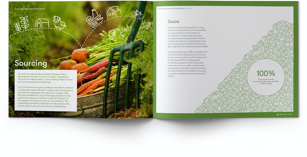
The clients were pleased with the results, and as a result, they decided to expand the business. Following this, I began applying the icon style to other applications within the brand, ensuring consistency across all touchpoints. I also created a set of illustrations that complemented the icon set, maintaining the same design principles and visual language. This cohesive approach not only enhanced the user experience but also reinforced the brand’s identity across different platforms and products.


Icon Collection
Below is the illustration collection I developed, which follows the same style as the employee value icons. This illustration set was designed to maintain visual consistency and align with the brand's identity. It has been widely used in the annual report and corporate social responsibility (CSR) report, helping to enhance the overall narrative and make the content more engaging. By utilizing this cohesive visual language, the illustrations not only support the brand’s message but also create a more dynamic and visually appealing experience for the audience.


Behind the scene: I draw different sizes of circles to create an object, then cut and rejoin those lines.
I enjoy doing this project, like a brain game, I always need to pick the right point to cut from millions of circles.